SAUVAGE PACKAGING DESIGN
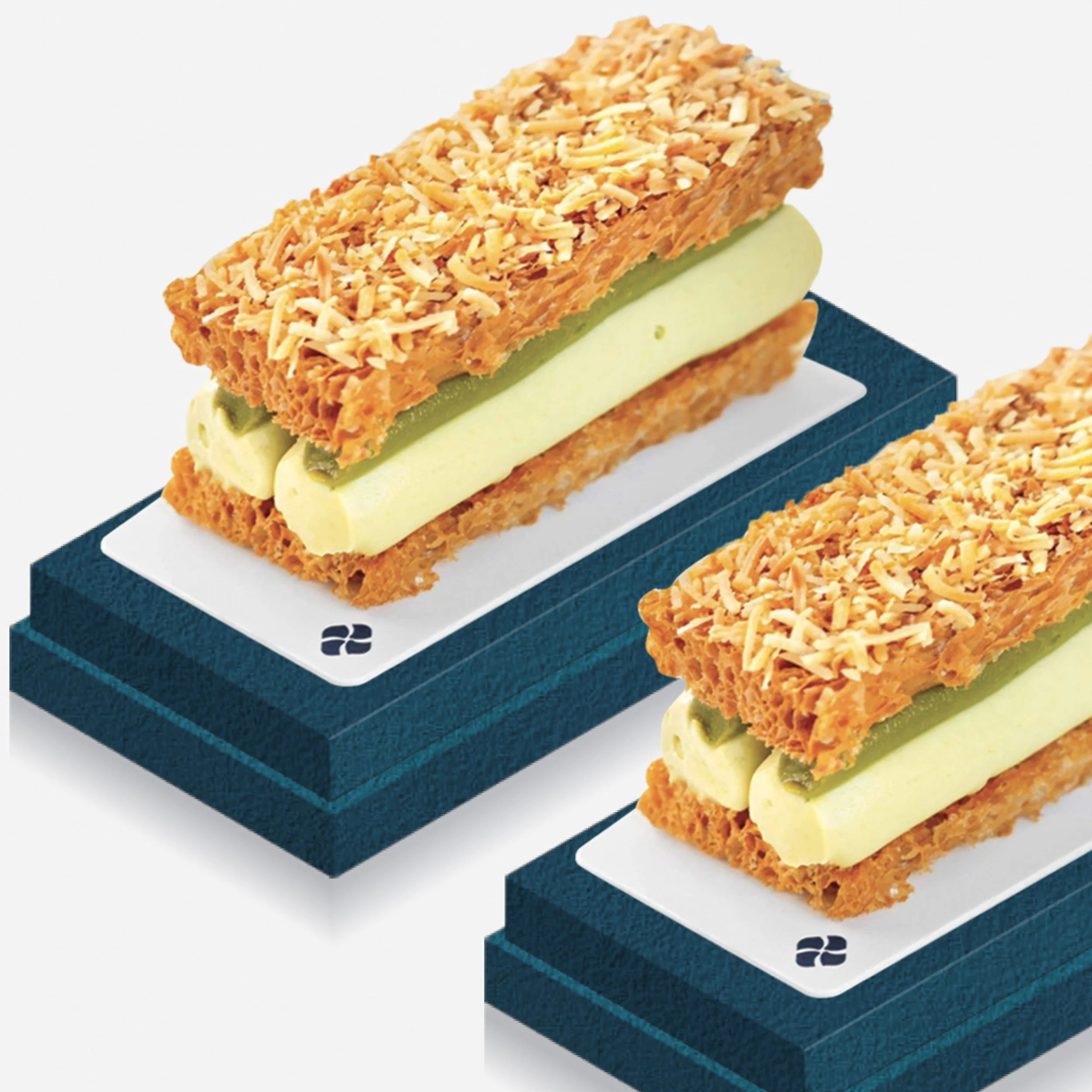
Sauvage is a dessert brand known for its craftsmanship and attention to detail. The packaging design reflects this expertise through a minimal yet expressive aesthetic—simple in form, but rich in flavor and subtle details.
Packaging Design
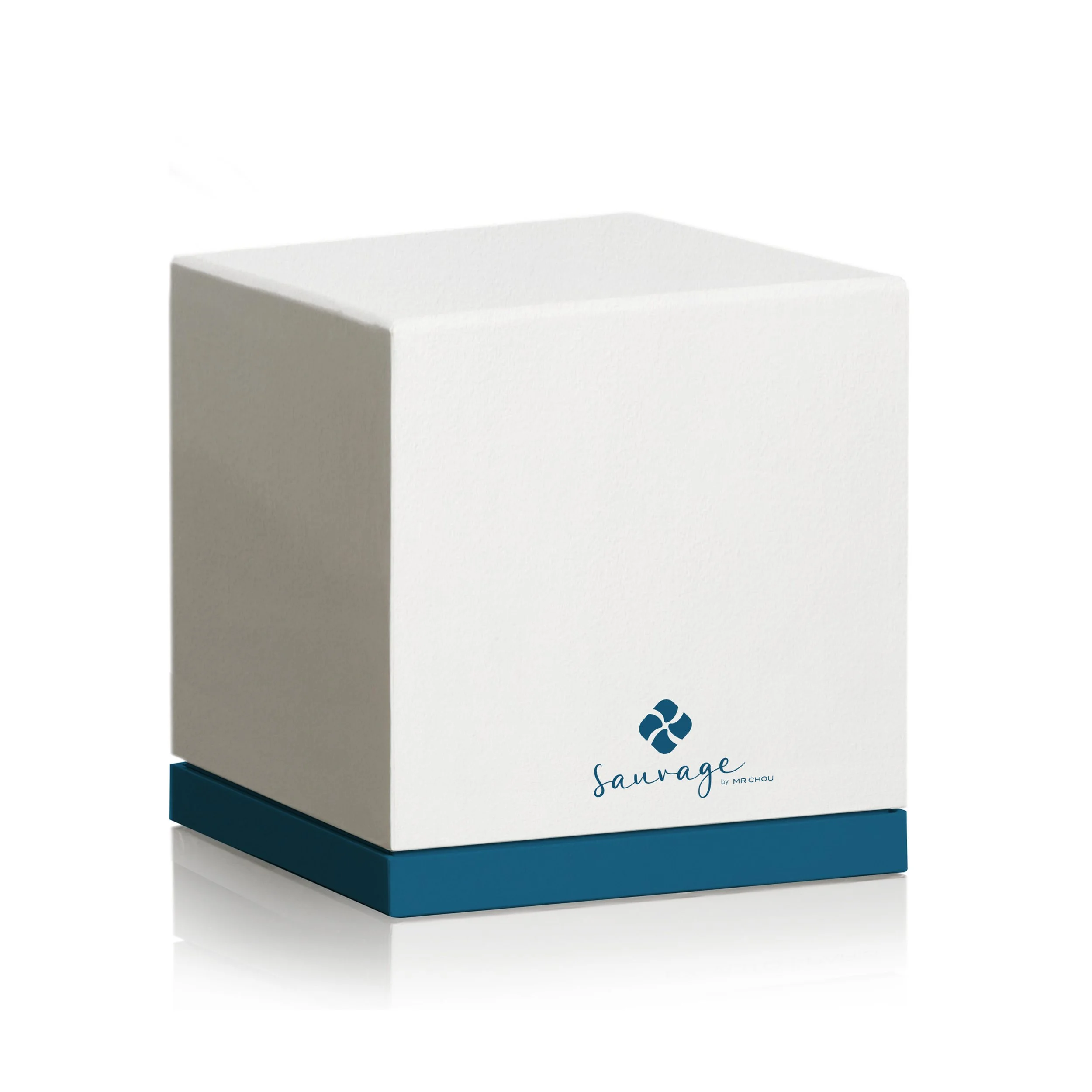
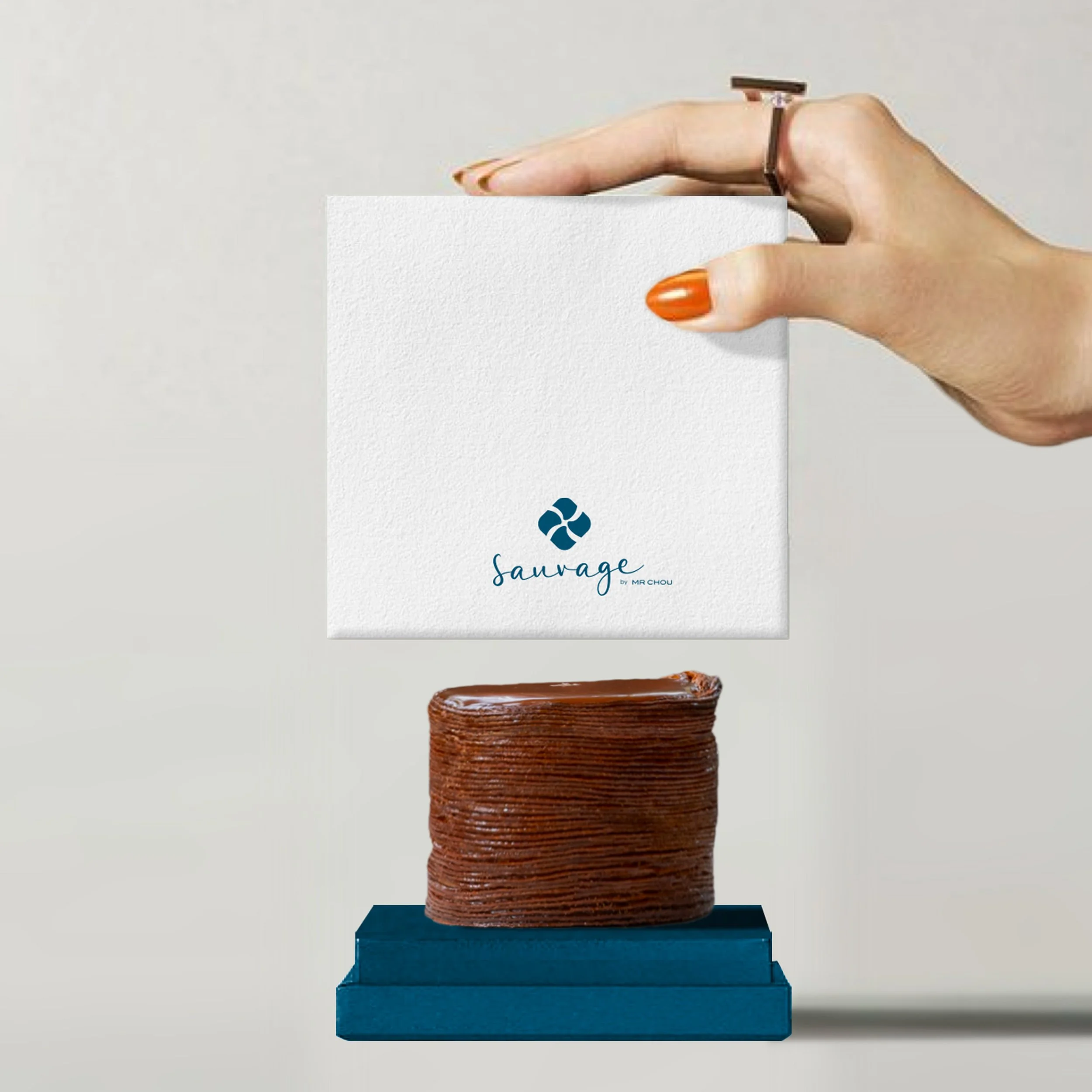
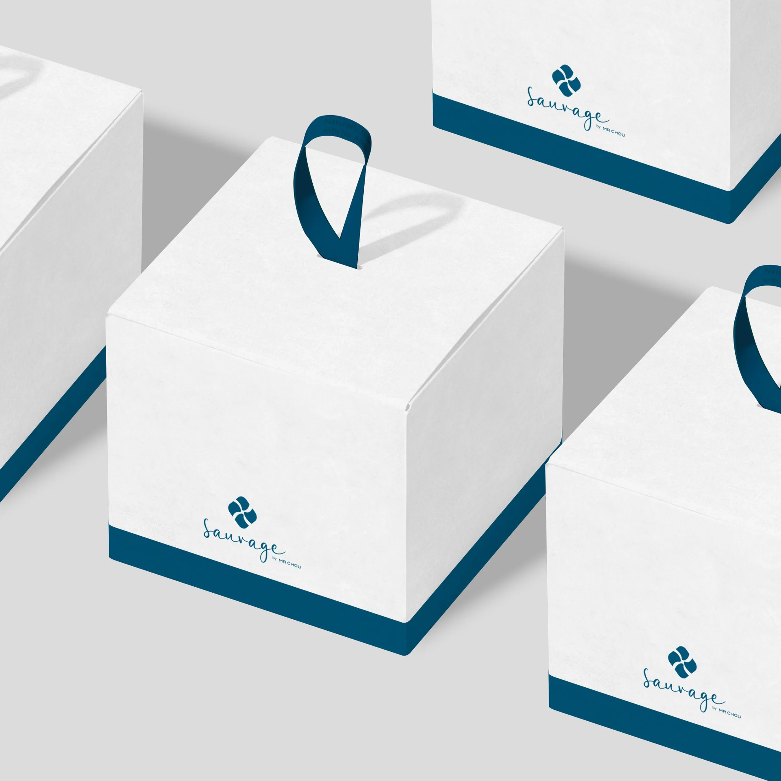
Beyond visual design, a flexible packaging system was developed to ensure practicality and ease of production. The approach avoids over-design while remaining true to the brand, resulting in a timeless, on-brand solution that works seamlessly across a wide range of products using a minimal number of packaging formats.