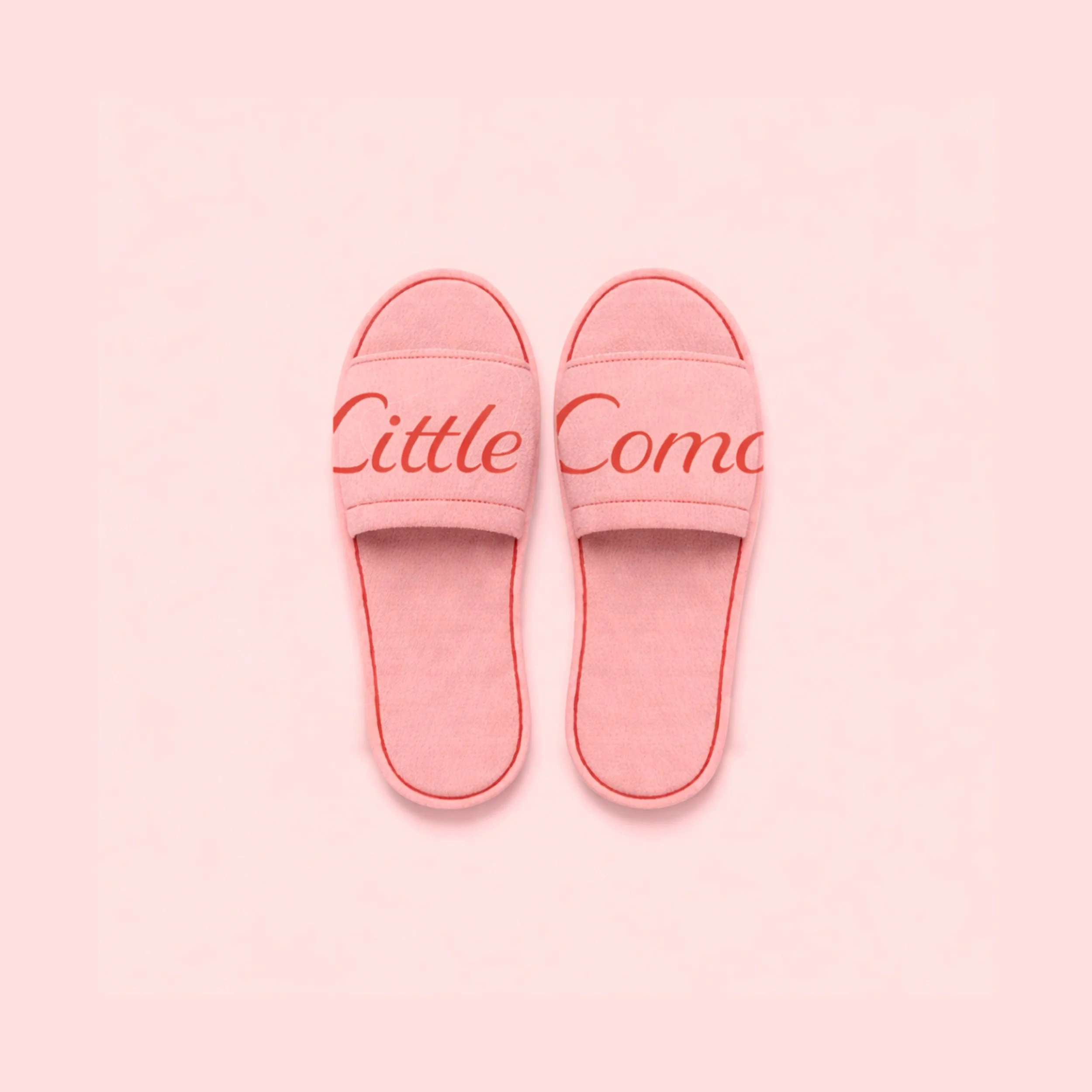
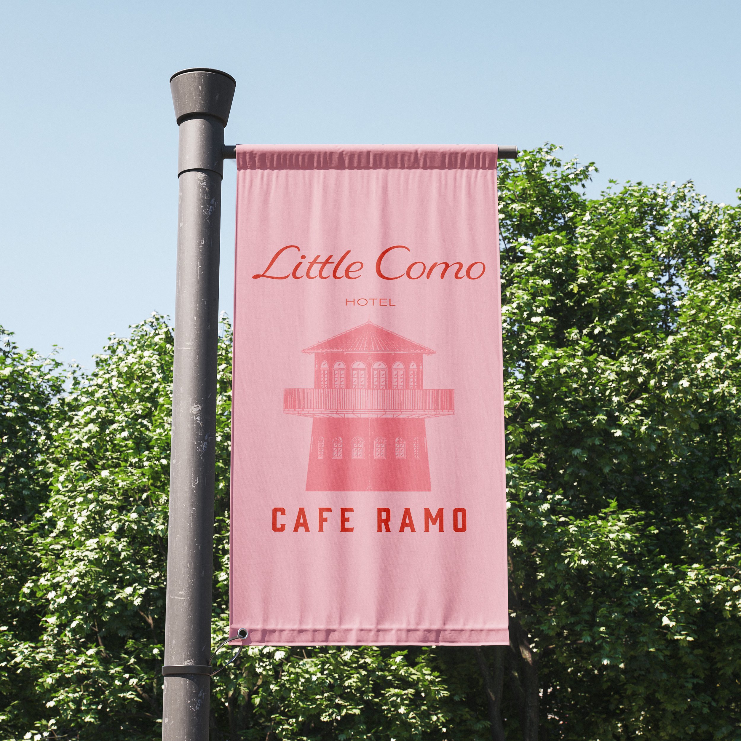
Little Como
resort and restaurant distinguished by its iconic old lighthouse, located at the heart of the property. The brand identity is crafted to evoke a romantic and warm atmosphere, making it an ideal destination for family retreats and meaningful moments of love.
Branding Identity
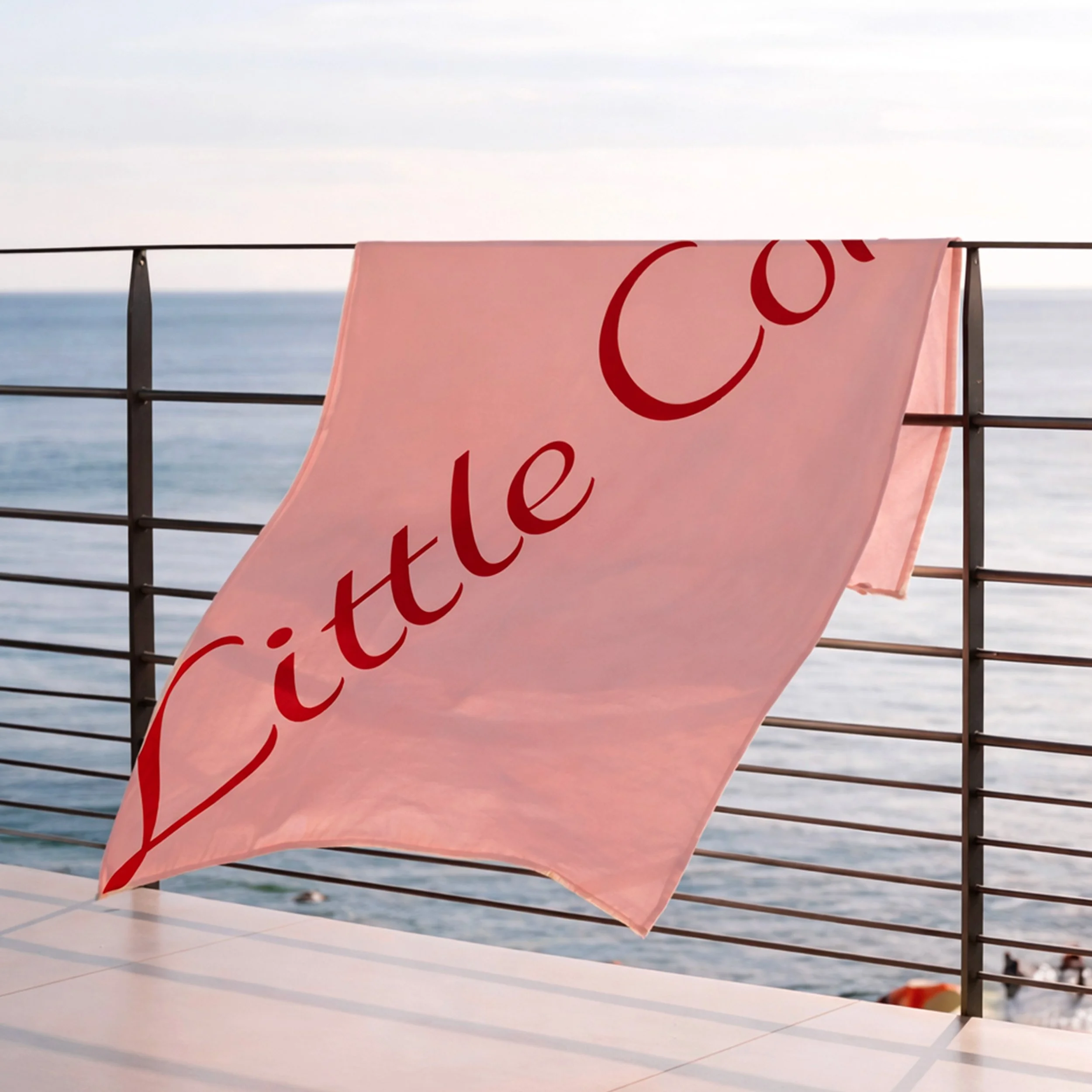
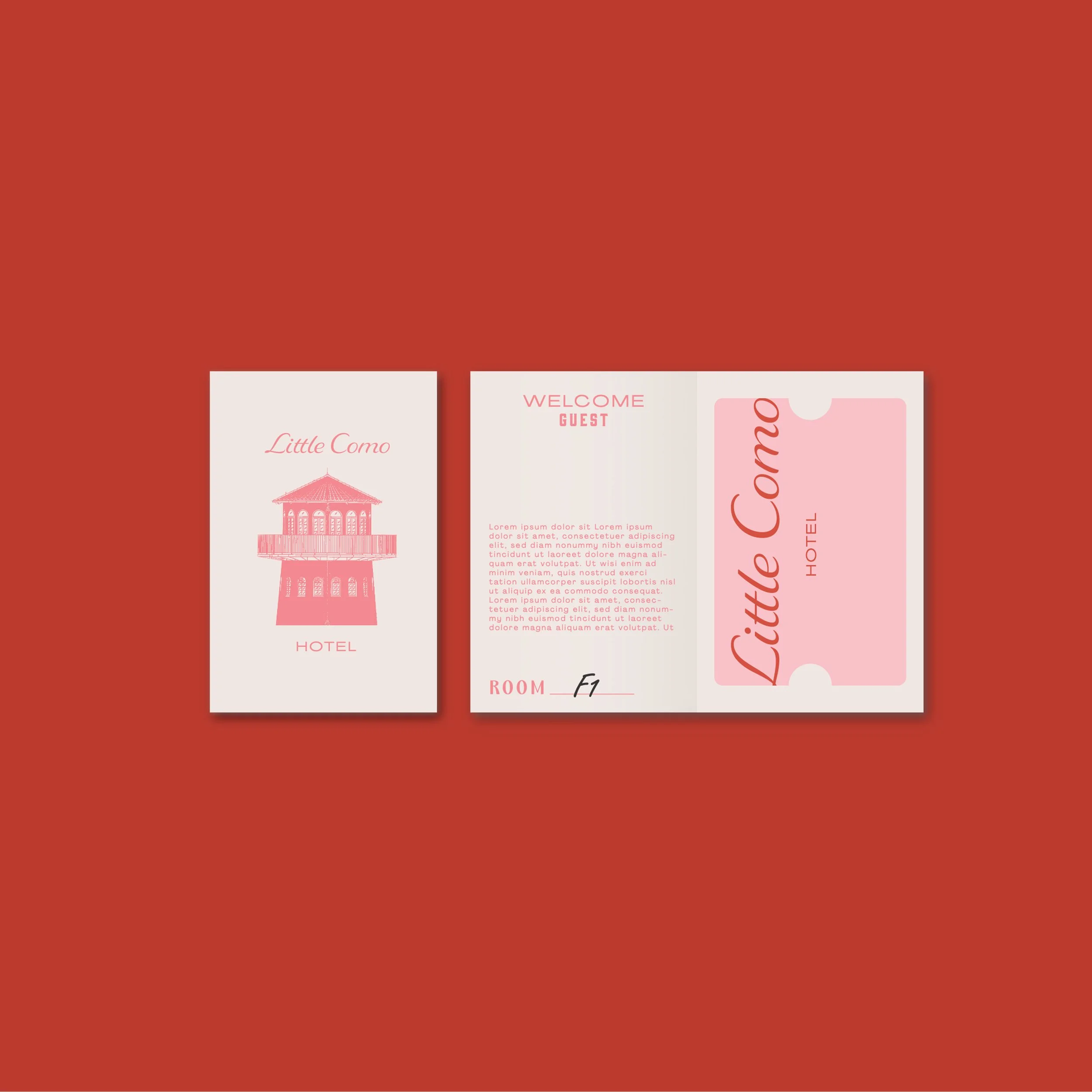
Colors and logo elements inspired by romance are thoughtfully applied across all brand collaterals, ensuring that every touchpoint within the project carries a subtle yet distinctive sense of identity. This cohesive approach allows Little Como to feel intimate, memorable, and emotionally connected at every experience point.