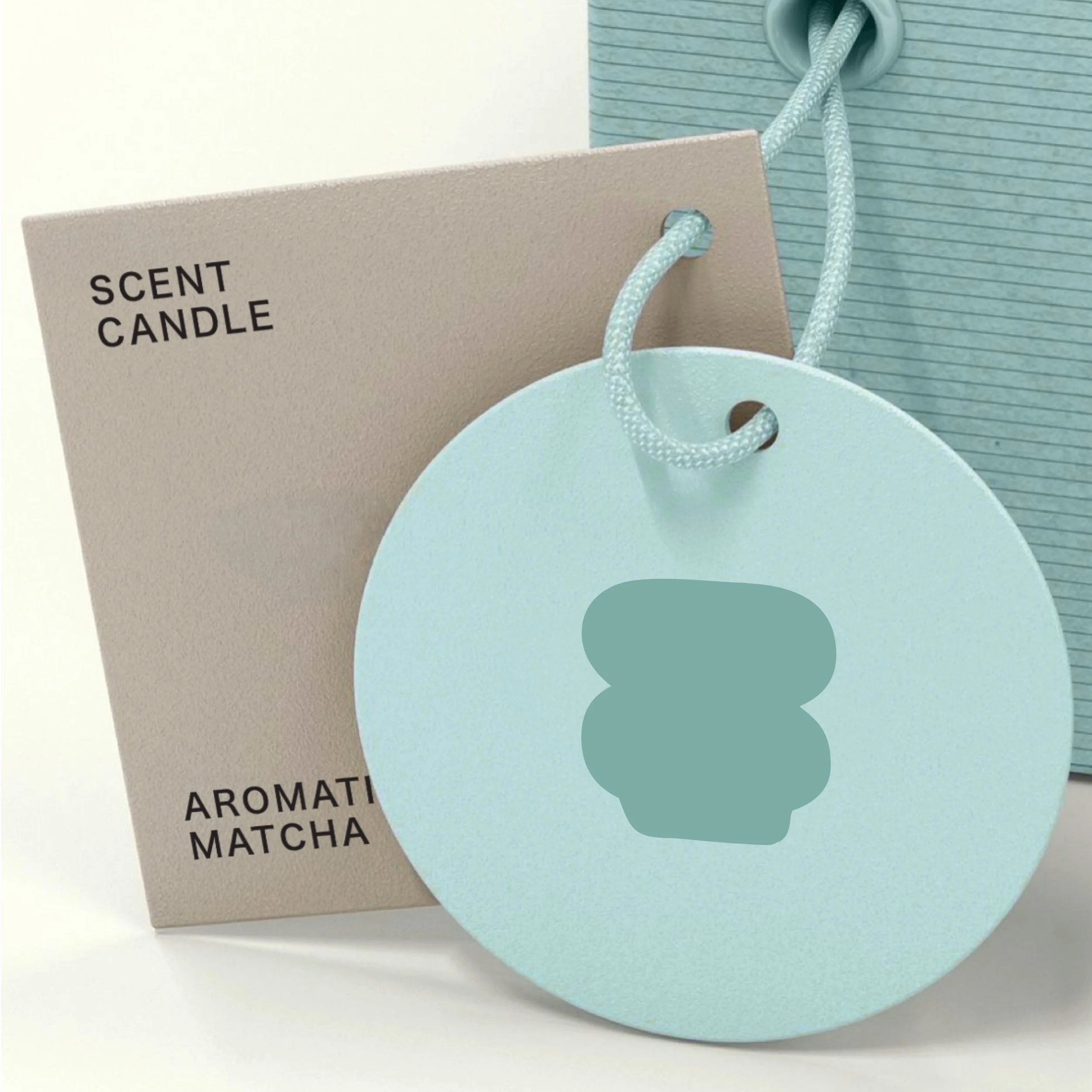
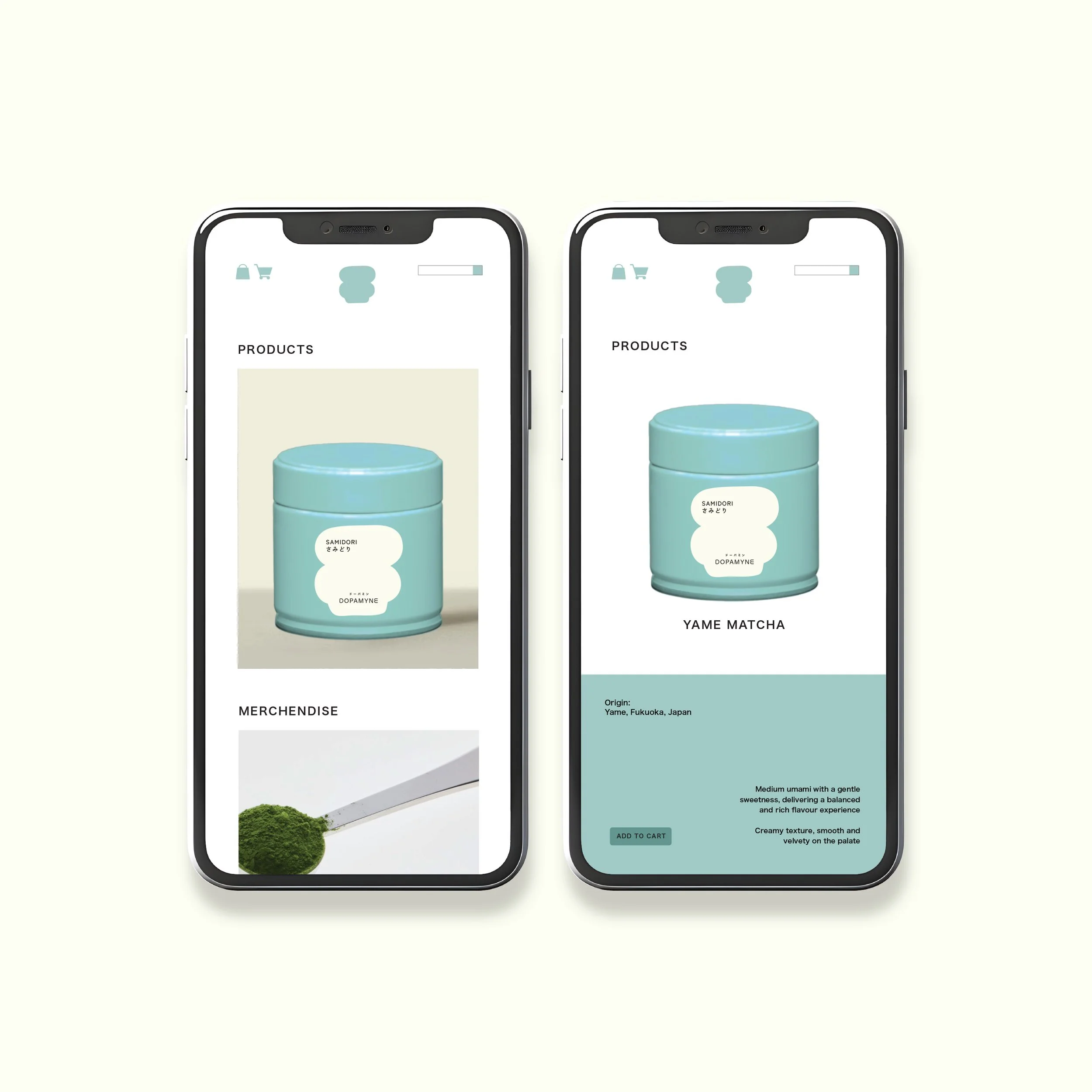
DOPAMYNE MATCHA
Dopamyne Matcha is a matcha brand built around positivity, balance, and emotional well-being. The use of a light teal to hue reflects a fresh, uplifting energy—echoing the essence of matcha as a natural source of calm focus and happiness. The visual direction embraces clarity and lightness, expressing a sense of optimism through a clean, contemporary aesthetic.
Branding Identity
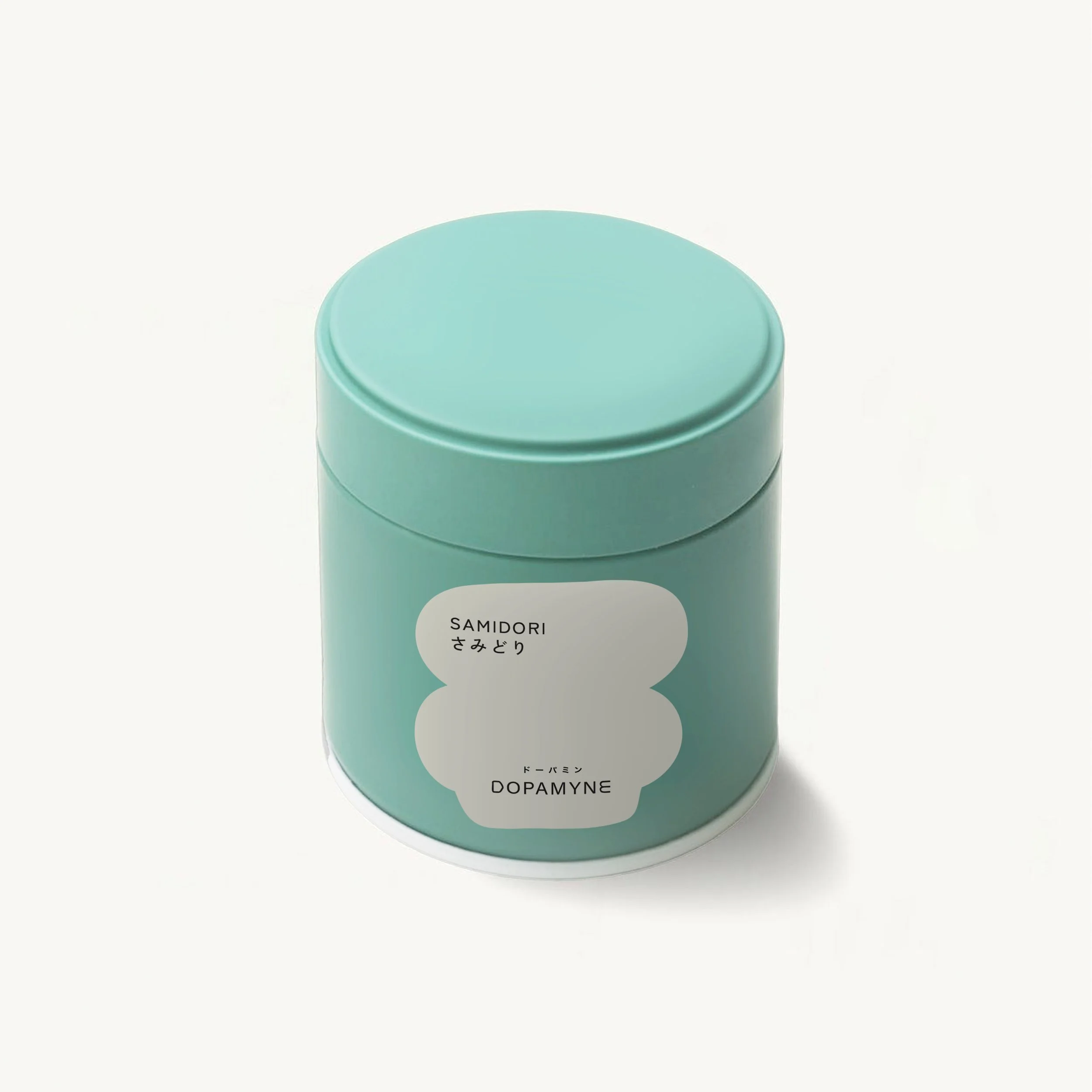
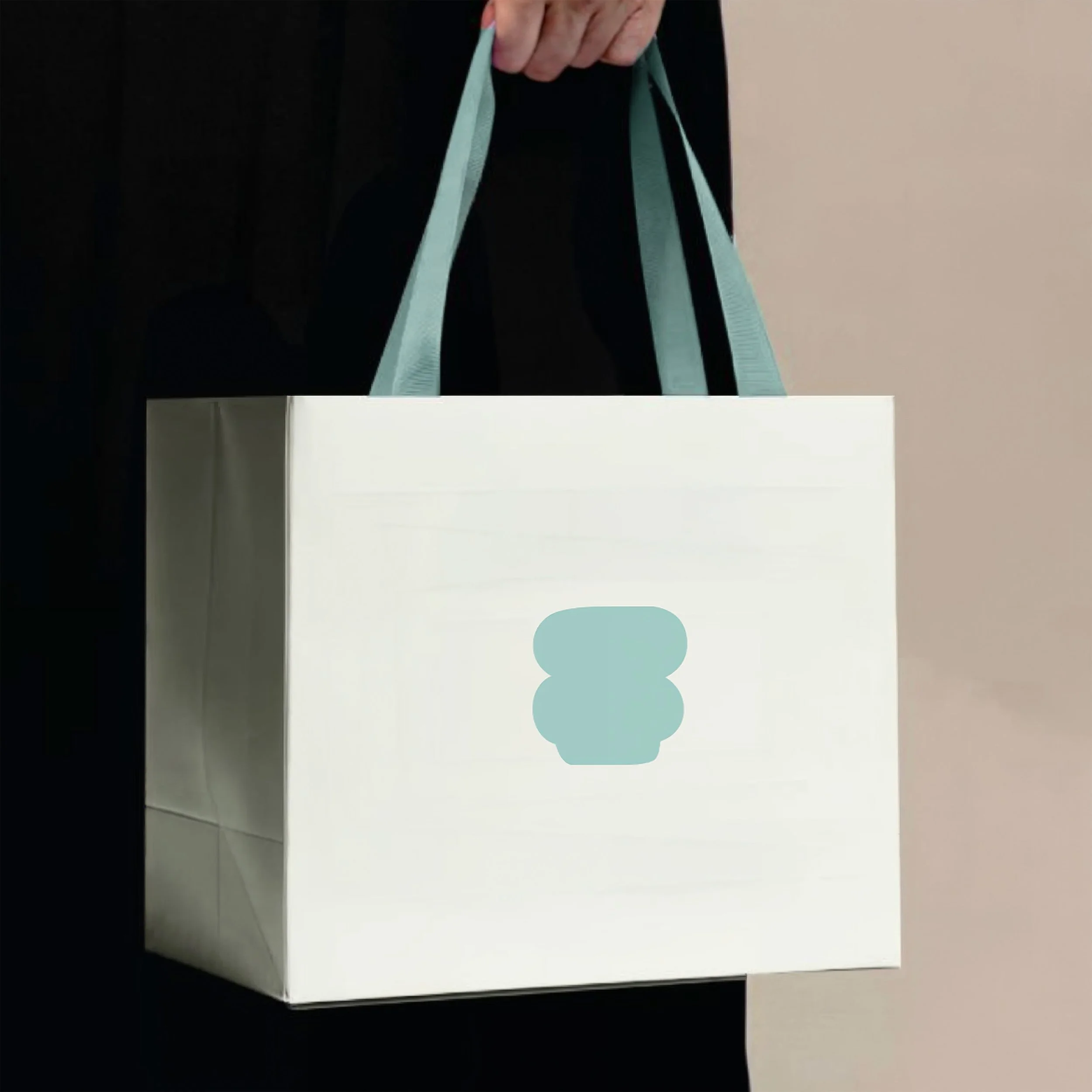
The brand’s design language follows a minimal yet premium approach, allowing color, form, and space to speak with intention. The logo, inspired by the Chawan (traditional matcha bowl), serves as a timeless symbol of ritual and mindfulness. Reinterpreted in a modern form, it represents Dopamyne’s respect for tradition while presenting matcha as a refined, everyday moment of joy